Change.org A/B Testing
My Role: The UX and UI Designer
Other Team Members: A Senior Designer, A Developer
Background
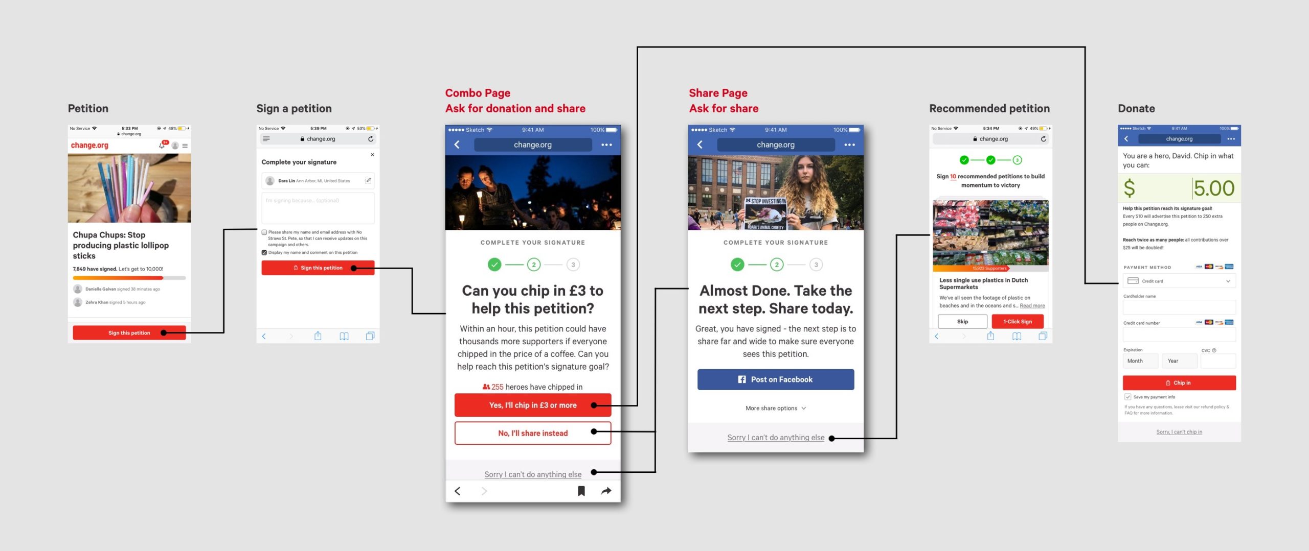
Change.org is the world’s largest online petition platform that reached to 200 million users in 2017. It empowers people to “start campaigns, mobilize supporters, and work with decision makers to drive solutions”.
My focus is the combo page and the share page. Below is the workflow showing the logic between relevant pages.
Project goal
1. Increase petition share conversion
2. Increase petition donation conversion
3. Increase average donation amount
method
For each A/B test, we have a control, a fake control (which is the same as the control), and two to four variants. The tests usually lasted for seven days. The user base was large enough for us to draw statistic conclusions.
Tool
Sketch
Google Optimizer
Google Analytics
measurement
1. Compared to the control, % of users clicked on the share button
2. Compared to the control, % of users shared successfully
3. Compared to the control, % of users donated successfully
4. Average amount per donation
behavioral economic concepts
My designs are based on the following behavioral economic concepts:
Herd Effect
Anchoring
Social Proof
Urgency
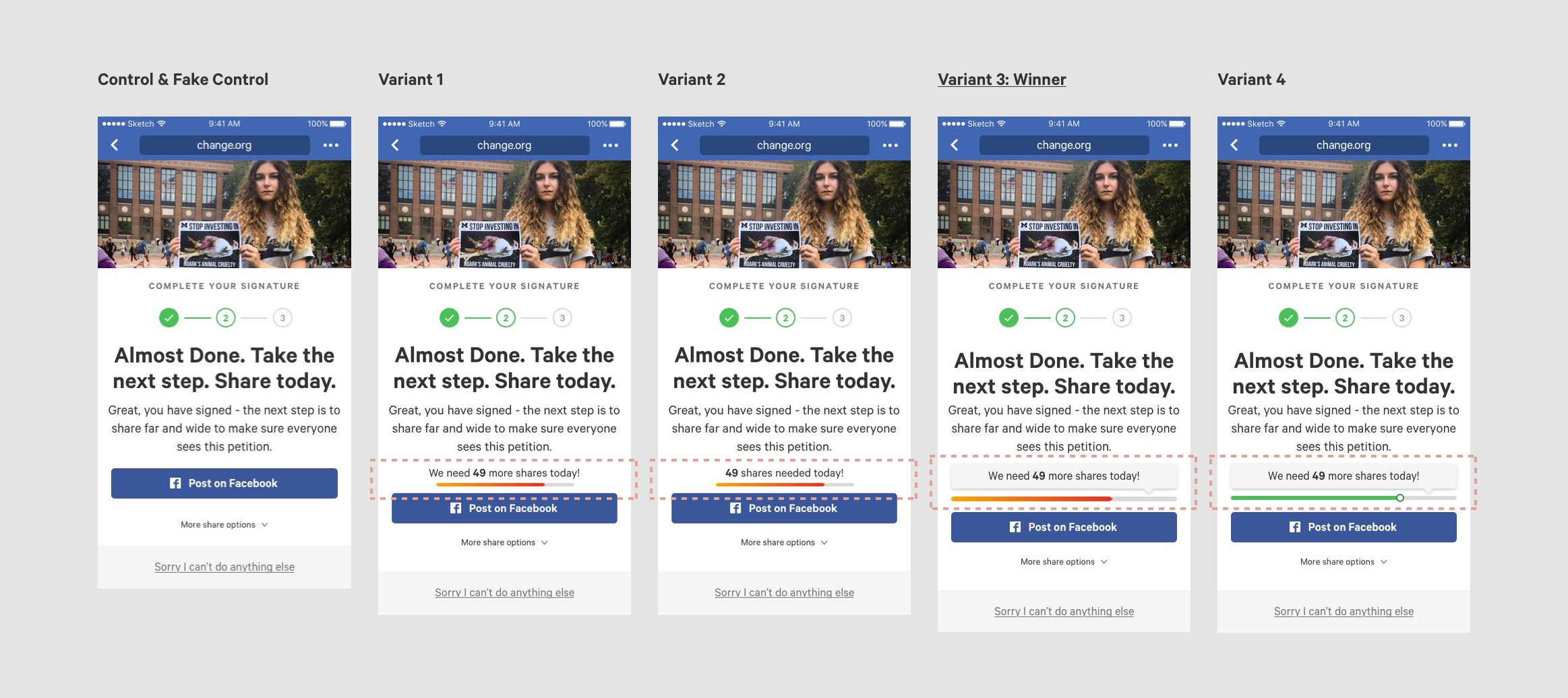
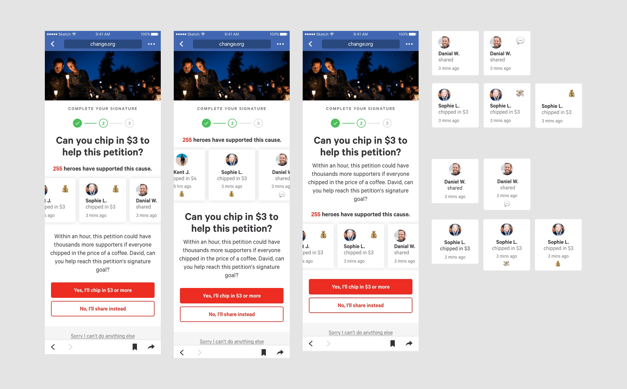
shot 1 - Progress to Goal
Hypothesis
We can increase share conversion by giving our users a specific goal to work towards.
Measurement
Compared to the control, % of users clicked on the share button
Compared to the control, % of users shared successfully
Result
The progress bar performed well in both measurements.
But synthetically, the large red progress bar and the copy inside bubble pattern stood out most.
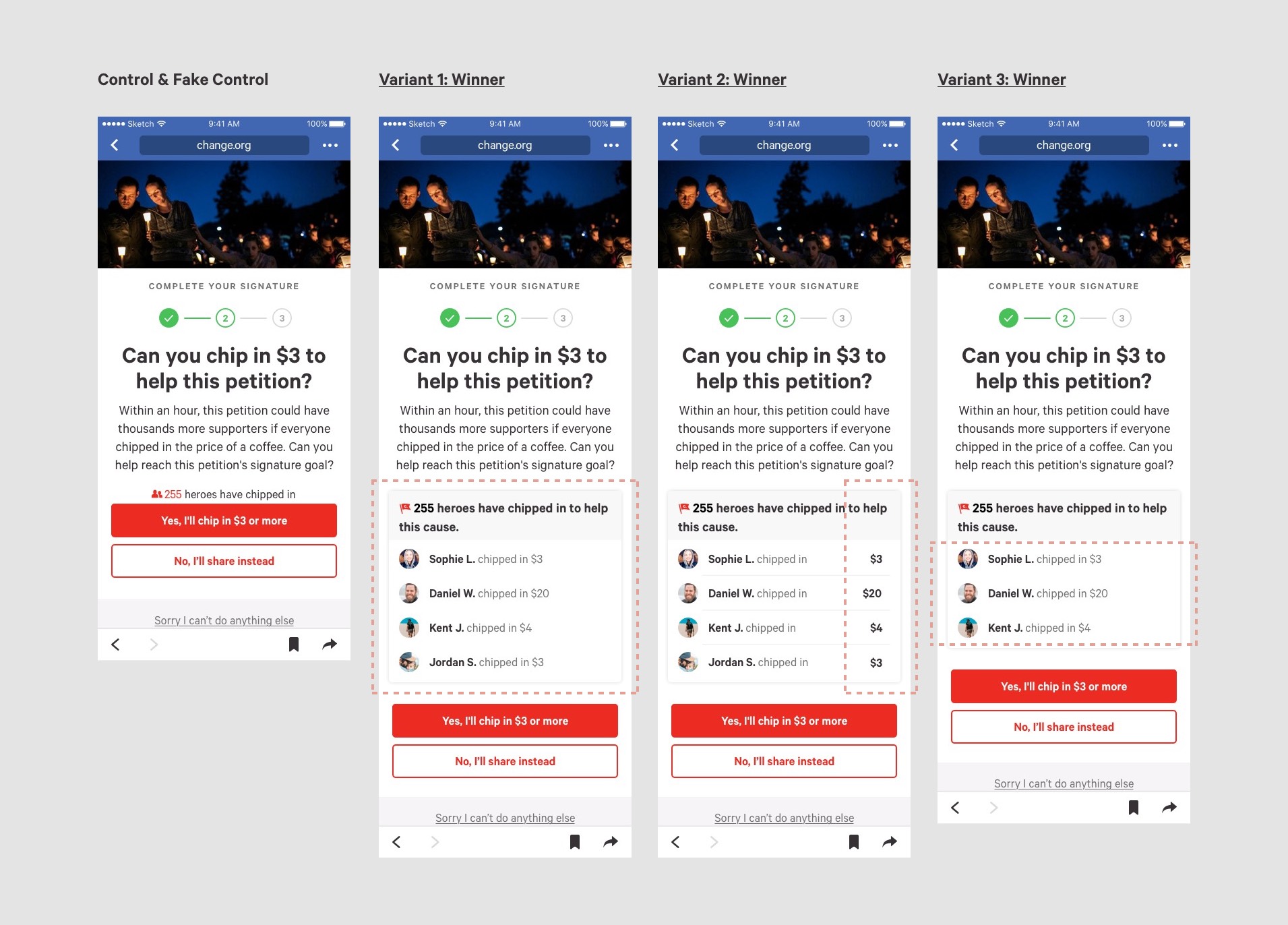
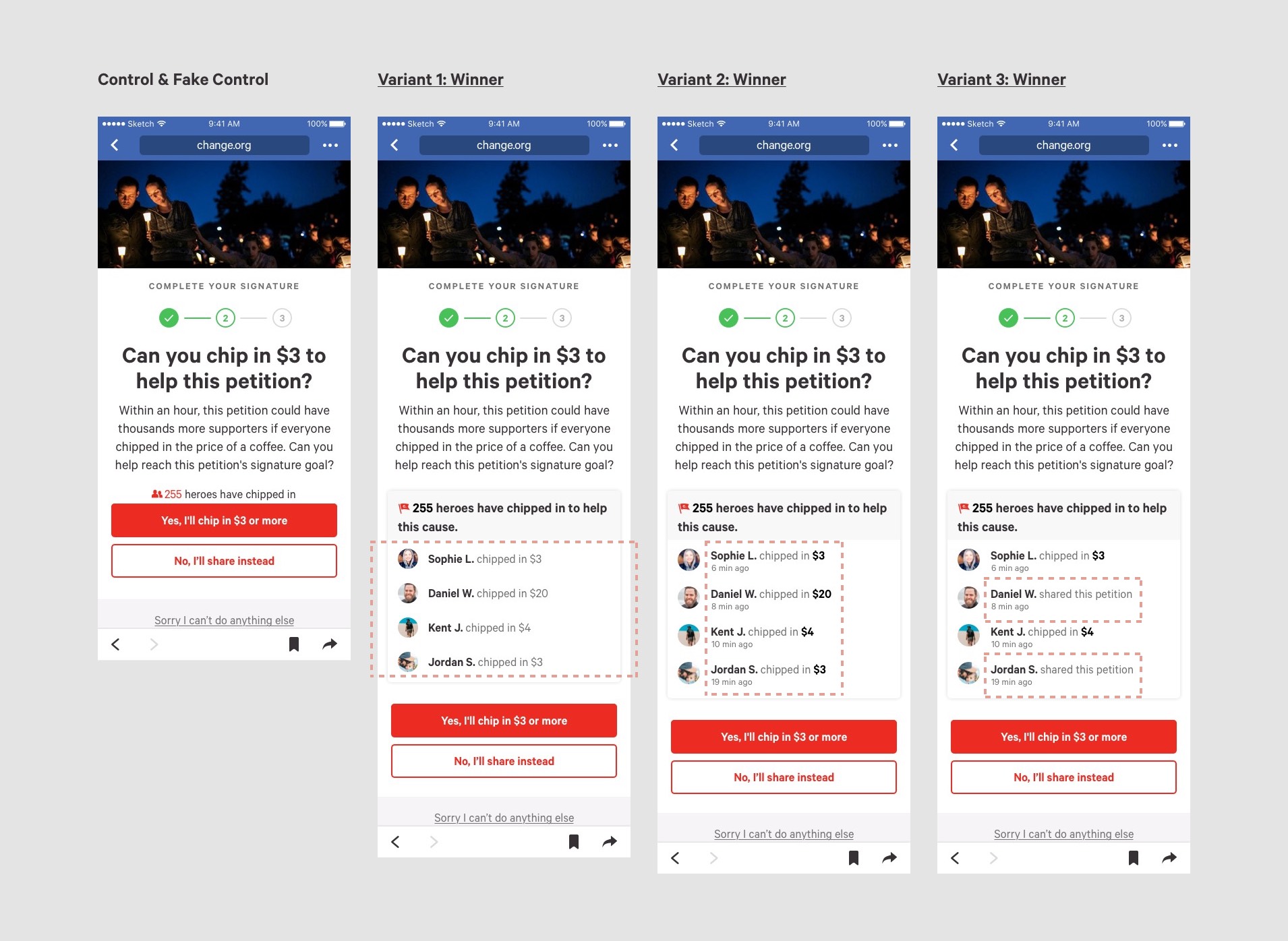
shot 2 - social proof on share page
Hypothesis
Leveraging the Herd effect as social proof, we can reduce the barrier to. A hero board of sharing can increase the share conversion.

Measurement
Compared to the control, % of users clicked on the share button
Compared to the control, % of users shared successfully
Result
The hero board of sharing was effective in recruiting clicks on the share button, but wasn’t effective in successful share conversion.
The hero board above the share button performed best in recruiting clicks on the share button.
The shorter copy as the hero board title was better than the longer copy.
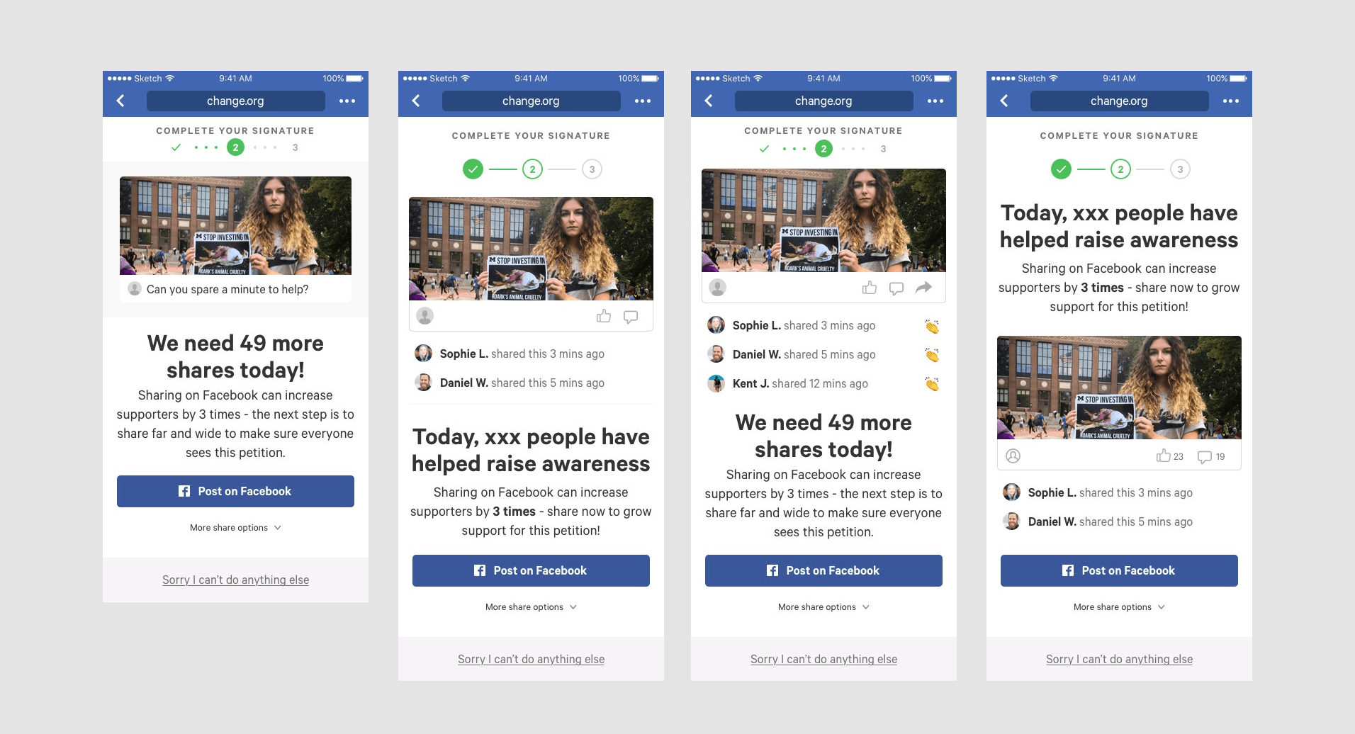
shot 3 - social proof on combo page
Hypothesis
Given the huge success of the hero board of sharing, we assume the hero board also works on increasing donation conversion.
Measurement
Compared to the control, % of users shared successfully
Compared to the control, % of users donated successfully
Average amount of per donation
Result
The hero board of donation increased the average donation amount.
The hero board was extremely outstanding in successful donation conversion, especially those four-row hero boards.
But the conversion rates of successful shares were off.
We also tested variant 1 in other countries of different languages, and it performed similarly.
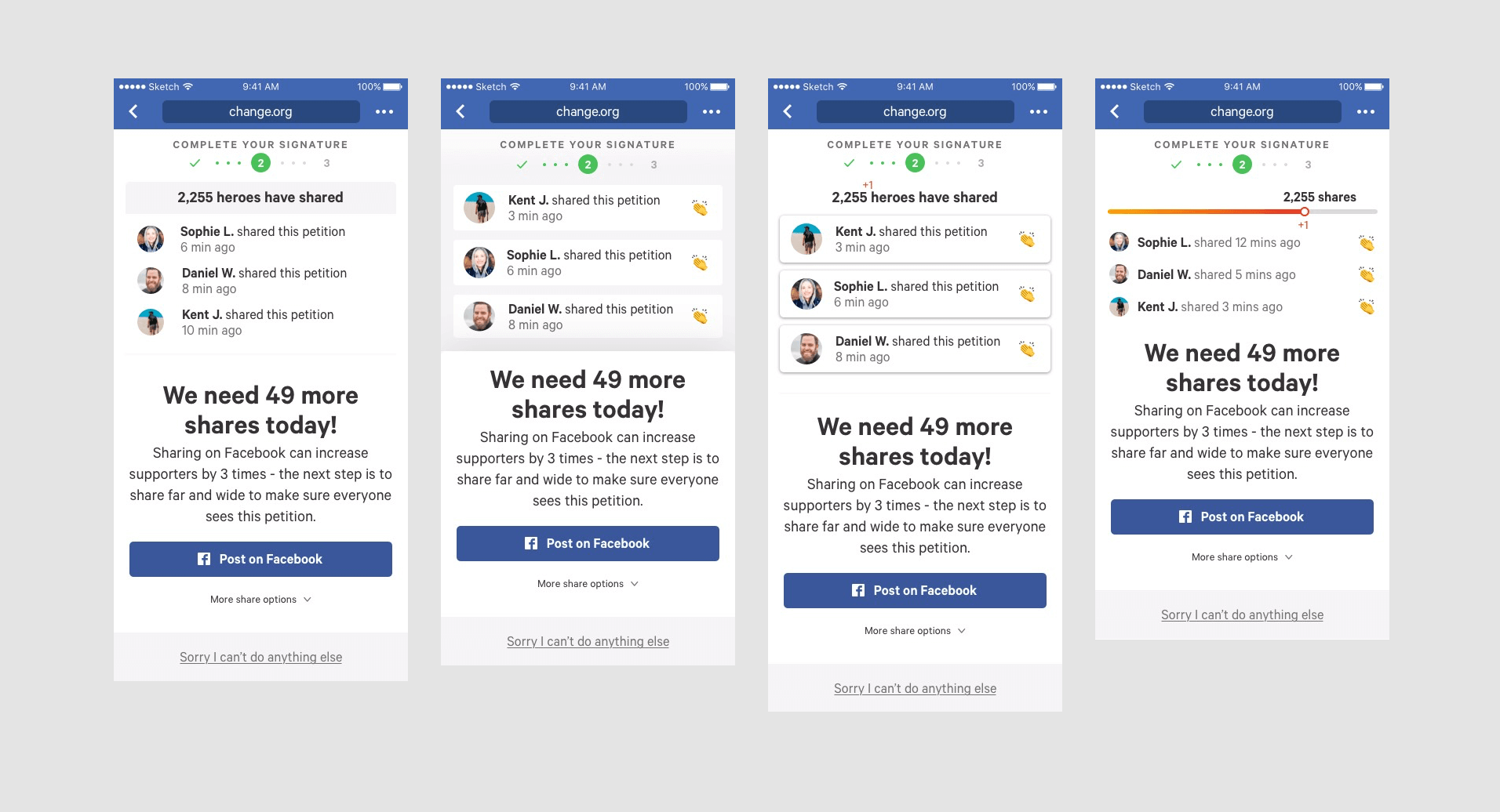
shot 4 - balance the share and donation
Hypothesis
Since the last shot showed that the hero board had a negative impact on share conversion. We can replace two of the rows of donation relevant social proof with share relevant social proof, to balance the decrease in share conversion.

Measurement
Compared to the control, % of users shared successfully
Compared to the control, % of users donated successfully
Average amount of per donation
Result
The comprehensive hero board performed much better than the control in both share conversion and donation conversion.
But in donation conversion the comprehensive hero board was less successful than the hero board of donation.
The results agreed with our hypothesis that the comprehensive hero board balance the share and donation conversion.
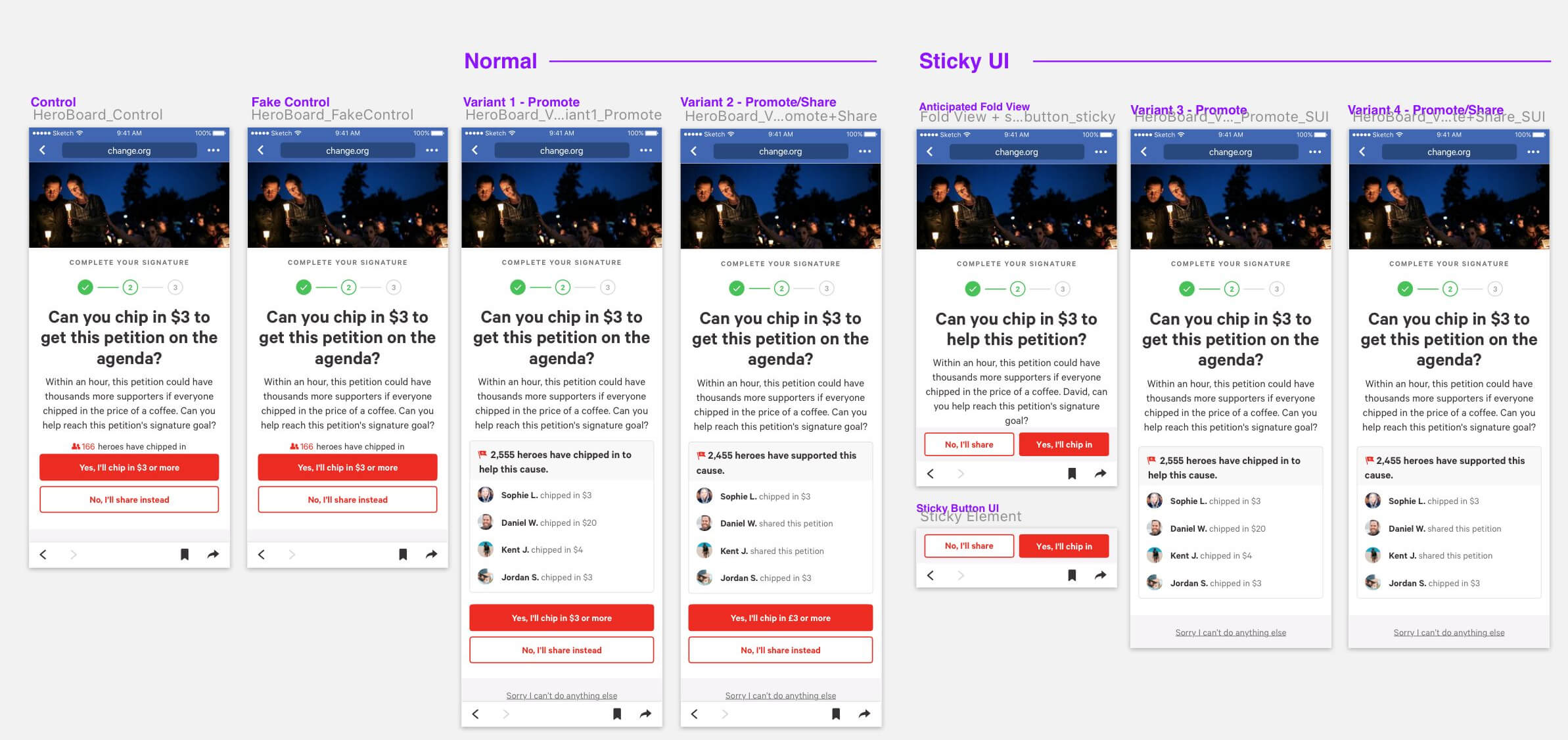
shot 5 - sticky ui exploration
Hypothesis
By using the sticky buttons in combination with the comprehensive hero board, we can increase both matrix.
Measurement
Compared to the control, % of users shared successfully
Compared to the control, % of users donated successfully
Average amount of per donation
Result
The sticky layout is able to protect share conversion better than the non-sticky alternative.
However, the lift is not significant enough to make up for the drop in donation conversion compared with the non-sticky variants.
We will stop exploring the sticky approach for the time being.
shot 6 - add timestamp
Hypothesis
By showing both actions and timestamp in the Hero Board, we can further increase the effectiveness of the hero board and increase share conversion and promote conversion.
Measurement
Compared to the control, % of users shared successfully
Compared to the control, % of users donated successfully
Average amount of per donation
Result
All variants performed outstanding in donation conversion.
The hero board emphasizing donation amount performed best in donation conversion and average donation amount.
All variants slightly decreased the share conversion but synthetically, the hero board emphasizing donation amount balanced best.
Pushing the buttons further down the page did not hurt conversion.
further exploration
Within the time and resource limit, I’m not able to test all my designs in A/B testing. Below are some ideas that were not tested but were interesting (a little bold) and had potential to succeed (in our opinion). I would like to show my exploration and how I design the variants. Each shot of tests I designed ten to thirty draft variants, and chose the ones we thought had the most chance to succeed based on previous tests, our understanding of users and design theories.

Selected Works

Build an MVP for a Health Insurance Mobile AppProject type

Change.org A/B TestingProject type